What is typography and why is it important?
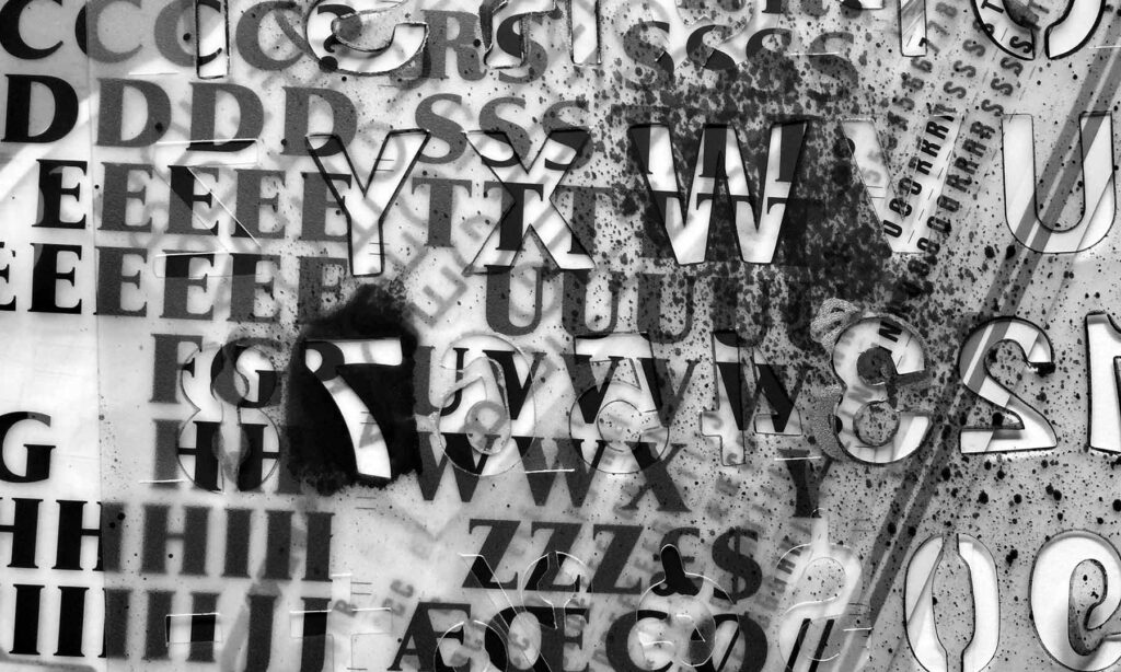
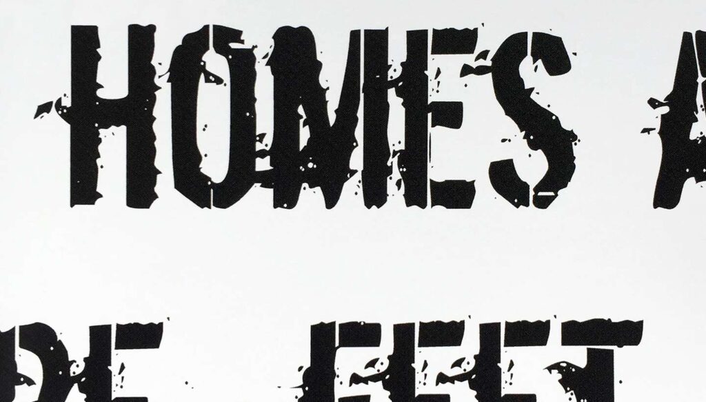
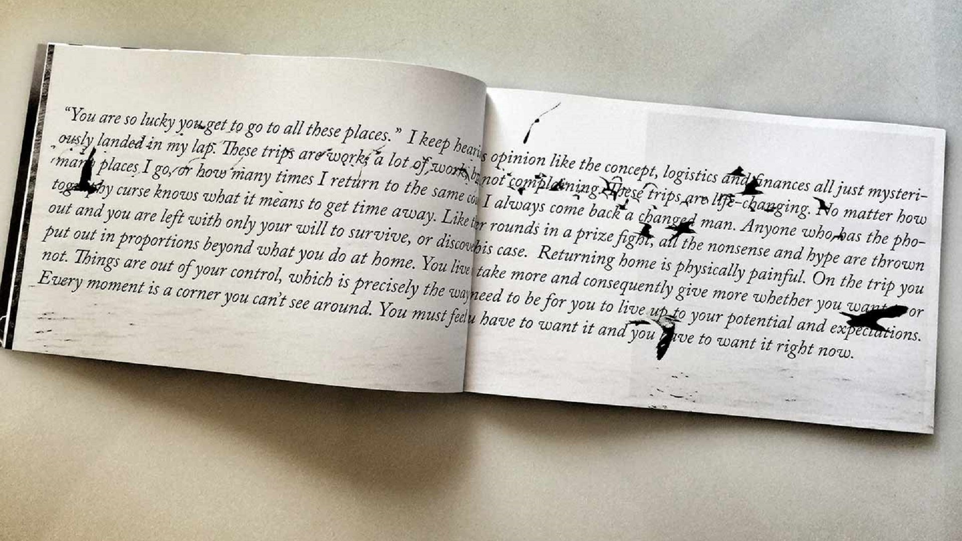
Typography is the art and technique of arranging type to make written language legible, readable, and appealing when displayed. The arrangement of type involves selecting typefaces, point sizes, line lengths, line spacing, letter spacing, and adjusting the space between pairs of letters.
In short, typography is a language all of its own, and if you are creating a book, magazine, or even a piece of wall art, knowing the basics of typography will ensure you are making the best decisions when it comes to type. Not to mention, learning typography is fun.
Now that we have a basic typography definition, why don’t we explore elements of typography design a little more closely:
Elements of typography
Two terms you will often hear in regard to typography are typeface and font. These two elements are related and play well together. Think of it like this:
A typeface is the design of lettering that can include variations such as bold, regular, light, italic, condensed, and more. Each one of these variations is a font. Someone who designs typefaces is called a type designer.
Another typography term is contrast, which refers to the grouping of two different typographical elements and using different traditional design methods to create a contrast. One element takes center stage while the second element takes less attention, but still adds to the overall design.

Typography design: contrast
There are four main techniques for creating contrast with typography; size, color, spacing, and shape.
Contrast by size
Size is relatively self-explanatory. Say for example you use a large typeface for the title of your book, and a much smaller, less dominant typeface for your subtitle. They are both important, but the second element does not distract from the first.
Contrast by color
Using color to achieve contrast means taking advantage of things like type density, using the full range of the grayscale, or using vibrant colors to offset different typefaces.
Contrast by spacing
Contrast through spacing can be as easy as justifying your type to the left, right, or center. But it can also be achieved through letter spacing, word spacing, or line spacing. Letter spacing refers to the measurement or space between letters. This same idea applies to word spacing and line spacing. Here is a little hint. Spacing takes practice, and there is a fine line between good spacing and going too far which could weaken the overall power of your design.
Contrast by shape
Finally, contrast by shape could mean using both italic and bold fonts together, or perhaps an artistic font paired with a simple or basic font.

Typography design: hierarchy
Typographic hierarchy refers to organizing type in a way that allows the reader to quickly find the information they are after.
Let’s say you are creating a book about poetry readings and you are listing the locations, the dates, and the titles of each event. Using a good typographical hierarchy means you are styling each of these data points in a unique way so that the reader can quickly identify a date, a location, or a title. The hierarchy should also take alignment into account. Type alignment refers to the placement of type in relation to other elements on the page, such as photographs, columns, tabs, etc.
Typography helps to create a sense of style and making small changes to your typography choices can be both liberating and strategic. My last piece of advice is this. Think about your typography as equal to all other aspects of your publication. Things like trim size, paper type, borders, and the size of the photographs are all important. Type is a peer to these other elements and requires the same amount of thought and dedication. Take your time and explore the options.
***
Blurb is a print-on-demand book publishing company. Design your book with our free bookmaking software, BookWright, and then learn about distribution options to sell it!


This post doesn't have any comment. Be the first one!