6 Professional Layout Design Tips
If you are new to design, it’s a good idea to start with the basics.
A layout is the way in which text and images are arranged. When these elements are combined effectively, the memorability of your content, its visual impact, and the viewer’s experience will be heightened exponentially. Media such as books, websites, advertisements, and museum walls all use layout in different forms.
In order to understand the different effects of various layouts, it’s vital to be familiar with the universal principles of design, as well as your own personal philosophy surrounding it. Our hope is that these layout design tips will give you the necessary foundation to develop your own process and make your layouts more successful.
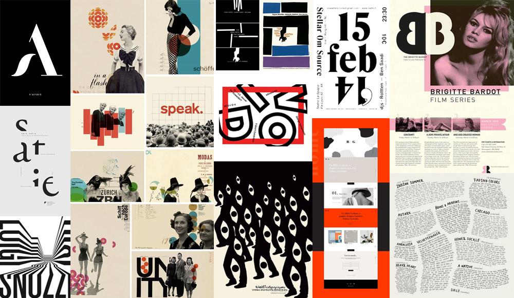
Design Layout Ideas
1. Research
Before you begin a creative project, it’s important to understand your place in the larger history of art and design. Never stop researching and learning about different styles, movements, and aesthetics—historical and contemporary. The popular minimalist style of web design, for example, is an evolution of the aesthetic popularized by the early 20th-century German art and design movement known as Bauhaus.
Drawing upon your own education and paying attention to what speaks to you personally will help you develop a unique, but relevant, voice that will allow you to reference (without ripping off) the work you admire most.
When starting a new project, refer back to mood boards you’ve created and images you’ve saved over time. If you don’t have a mood board that feels relevant to your current project, make a new one and take the time to understand the historical relevance of the direction.
2. Content and Concept
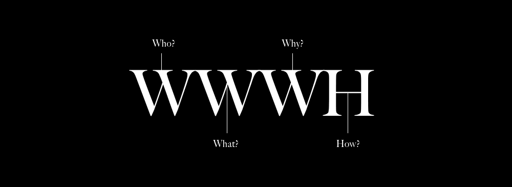
The most important step in layout design is deciding on your design concept.
After reviewing your content, ask yourself the following questions:
- Who is your audience?
- What is your message?
- Why is your message important?
- How do I want the viewer to feel?
After answering these questions, consider any additional parameters and whether or not you think your content is best communicated through traditional or non-traditional methods. For example, are you designing a layout for a medical brochure for a hospital or the album insert for a punk band?
Different projects require wildly different approaches. It is up to you to determine the best way to communicate your message to your audience.
3. Hierarchy
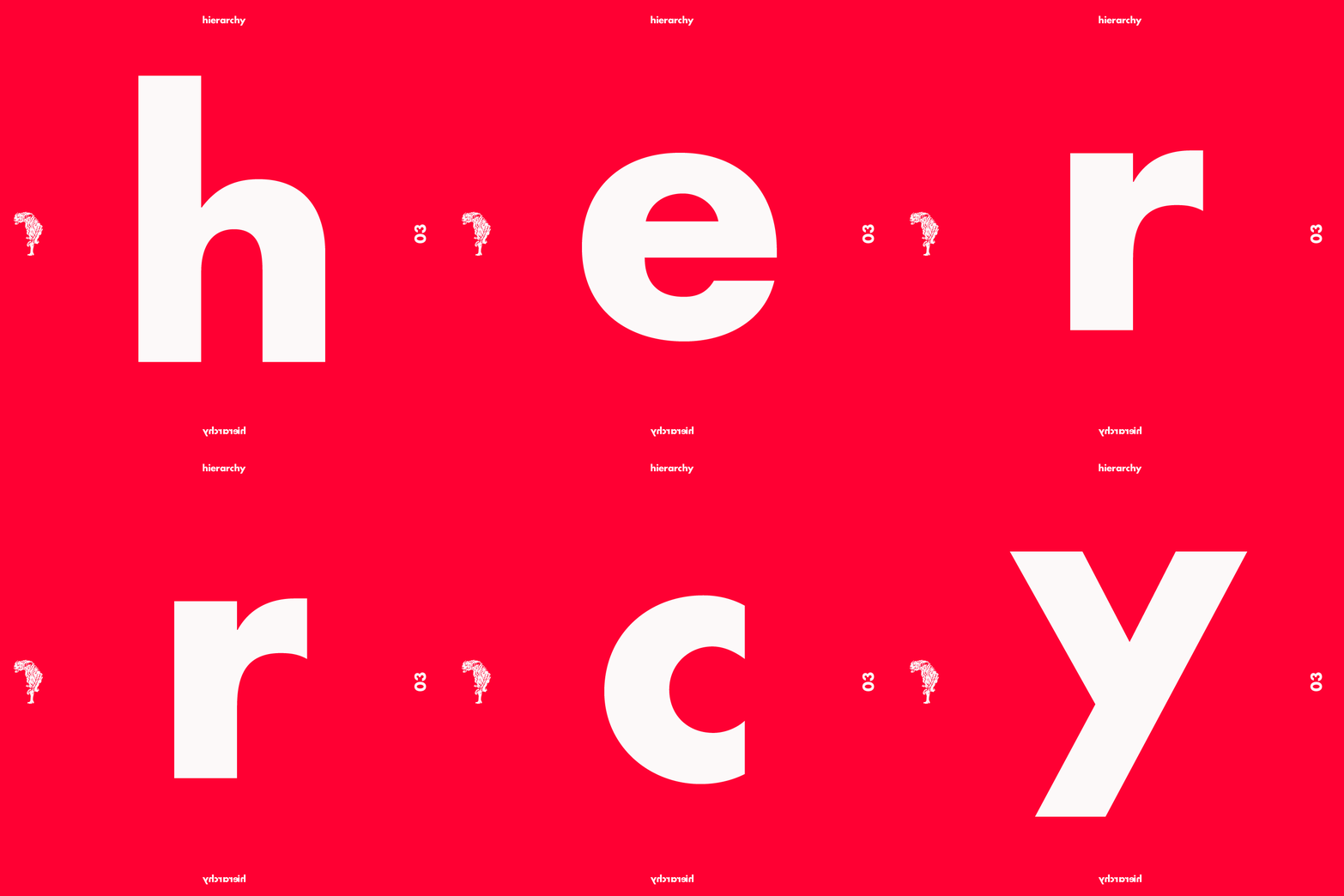
It’s often said within the advertising industry that consumers decide if they’re interested in a product within three seconds of viewing of an ad. For this reason, your layout design must always communicate the most important message first. Structuring the text and imagery of your layout with this hierarchy in mind will provide you with the necessary parameters when considering format, grid, and alignment.
Design should never dictate the text elements, and vice-versa. As a designer, it is your job to make sure these two components work together in harmony and that your message is understood.
4. Format, Grid, and Alignment
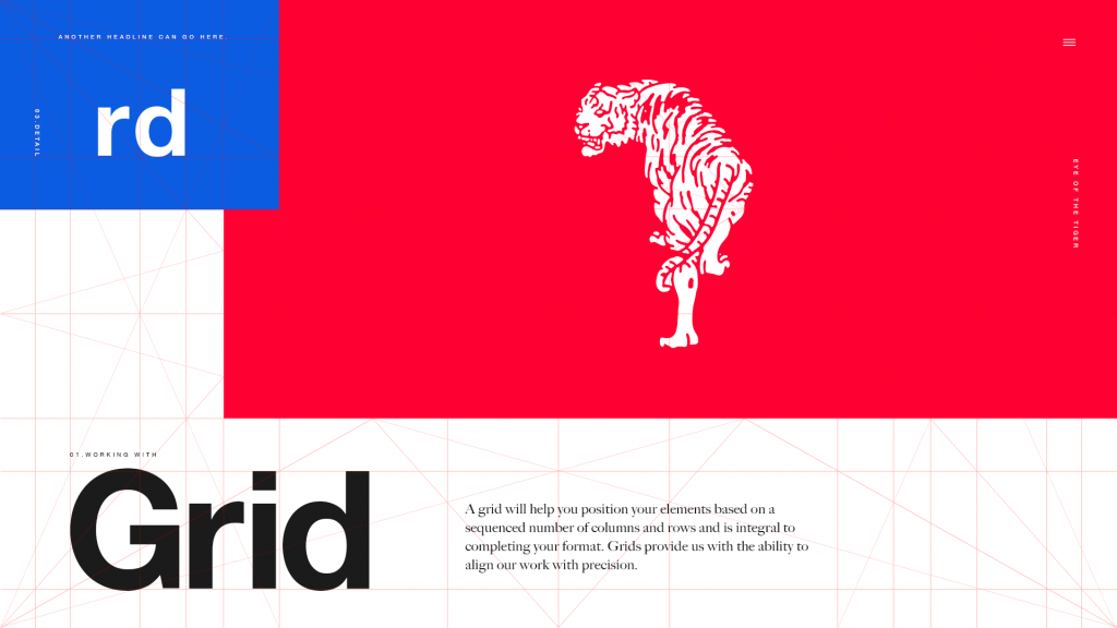
At this point, the format that will work best with your visual direction, concept, and established hierarchy should be starting to solidify. From here, you should be able to establish the correct dimensions of your layout and the basis of your grid.
A grid will help you position your elements based on a sequenced number of columns and rows. Grids provide us with the ability to align our work with precision and are integral to completing your layout design.
When considering the alignment of your layout, keep these principles in mind:
- The Golden Ratio: a special number approximately equal to 1.618 that appears many times in geometry, art, architecture, and other areas. It can be used to create pleasing, natural looking compositions in your design work.
- Rhythm and consistency
- Balance and/or tension
- Deviation from alignment or “breaking the grid” (when it enhances your concept)
- Typography (more on that next)
5. Typography and Font Pairing
Choosing the best typefaces for your layout can be a daunting task. First, because there are so many options; second, because the aesthetics of typography are subjective. This is where your knowledge of typeface and the history of various fonts will come in handy. For example, if you unknowingly choose a font that has previously been used in a popular ad campaign, it may have an unintended connotation for your audience.
Do your research and refer back to your project’s mood board before you make a decision.
There are four main categories of typography: Sans Serif, Serif, Decorative, and Script. Here are a few basics to keep in mind as you play with different font pairings:
- The Readability of a font should take precedence over aesthetic. To ensure readability, consider your text alignment as well as the typeface(s) leading and kerning. Minor adjustments to spacing can make a big difference.

- Create Visual Contrast by combining two different fonts or using the same font in different weights. The classic pairing of a Sans-Serif headline and Serif body copy is a good example of a simple, high-impact font pairing. A common rule of thumb is to use no more or less than two or three fonts within one layout, but once you’re familiar with the rules, it’s possible to break them effectively.

- Superfamily to the Rescue! When in doubt, the easiest solution to a font-pairing dilemma is selecting typefaces from one font-family with multiple font-weights. These fonts work together naturally. All you have to figure out is how you want to arrange them.

- Consider the Mood of a font or its ineffable emotional qualities. These are the adjectives we use to describe the way the font ‘feels’—playful, mysterious, retro, serious, sad, etc. Determining the mood of a font is easily the most subjective part of typography, but it’s one of the most important concepts to keep in mind when pairing fonts. Mixing fonts of incompatible moods can derail even the best content. All you can do is rely on your research and go with your gut.
- Know Where to Look for interesting classic or original typographies. Everyone has their go-to websites, (mine is Typewolf) but there are countless resources available.
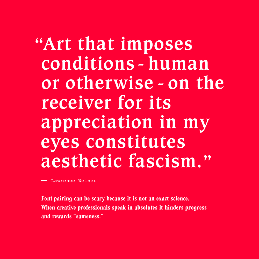
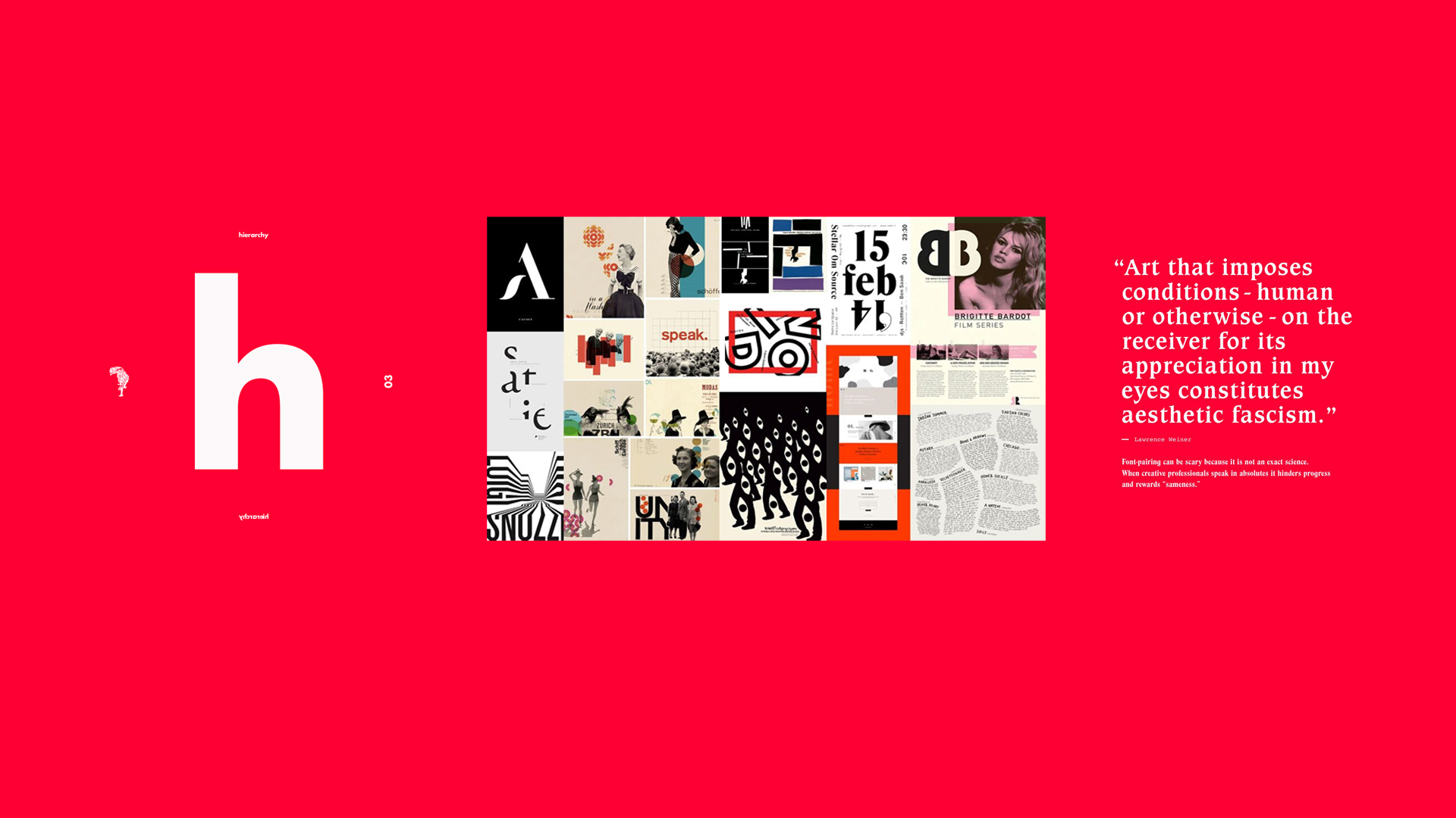
- Don’t Be Afraid to Experiment or break the rules. This is how we learn. Font pairing can be scary because it is not an exact science, but when creative professionals speak in absolutes, it hinders progress and rewards “sameness.”
Take a deeper dive into Typography.
6. Review and Improve Your Layout Design
Being able to edit and modify your layout design is crucial to the creative process. It takes practice, patience, and the ability to differentiate between constructive vs aesthetic criticism.
I have a mental checklist that I use as part of my review process:
- Am I communicating exactly what I want? Will my audience understand my concept?
- Is there a rhythm and consistency to my layout and design?
- Do I have enough contrast? If I squint, is my eye still drawn to the main message?
- Is everything evenly spaced and does the hierarchy feel balanced?
- Are there “orphans” within my body copy?
- Are the design rules I am breaking necessary?
- Do I need to edit or remove text or imagery that feels redundant?
After proofing, you may also want to ask a colleague or peer for constructive feedback.
Final Thoughts
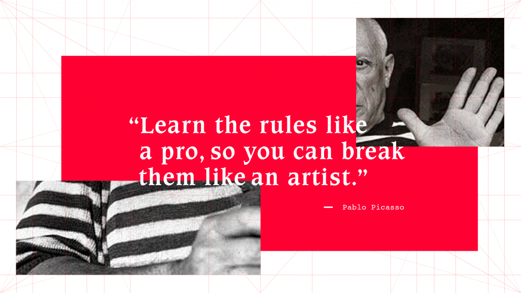
In summary, when approaching layout design remember to research and understand the universal principles of design. Keep these six layout design ips in mind for yoru next media project. In the words of Picasso, “Learn the rules like a pro, so you can break them like an artist.”
Share your top layout design tips in the comments below. Or, put Stacey’s tips into practice and start designing the layout of your own book.

This post doesn't have any comment. Be the first one!